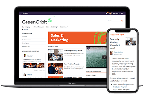

At GreenOrbit, we are always finding ways to make our intranet software more helpful and useful for everyone. We battle with ease of use, good design, and ensuring your intranet looks great on any laptop, phone, or tablet. In doing so, we listen to you, our customers, to recognize and identify what you want and what we can do better. As a result, we are constantly reviewing, testing, and enhancing the GreenOrbit software.
Well, it looks like your feedback and our hard work has paid off.
Announced on July 30, 2019, GreenOrbit was shortlisted for the 2019 SaaS Awards for best UX/UI/Design in a SaaS product category. (UX stands for User Experience – the experience of using the software, and UI stands for User Interface – how the software looks)
SaaS stands for Software as a Service. SaaS is one of the three major categories of cloud services, along with infrastructure-as-a-service (IaaS) and platform-as-a-service (PaaS). SaaS is also known as hosted software or on-demand software. It is a distribution model for software, whereby instead of downloading the software to run locally on your PC, the software is hosted by a third-party provider. People then access it over the internet, typically through a web browser.
The SaaS Awards are a sister program to the Cloud Awards. In 2016, the Cloud Awards was augmented with the SaaS Awards recognition platform to more fully represent the breadth of cloud services available as software solutions. The SaaS Awards celebrate SaaS solutions across public clouds, as well as alongside private, single-tenant solutions, off-premise or on-premise. Visit the SaaS Awards website to find out more.
Do you want intranet software that not only looks great, but allows for customization? Do you want an intranet that allows collaboration and is easy to use?
Great, these are just some of the things making GreenOrbit unique and different:
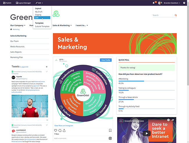
Ability to edit a page layout as Draft, Staging, or the Live Version
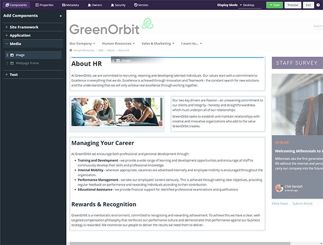
Layout Manager Experience – easy drag and drop
Designing great UI/UX in our intranet software is often challenging, but that’s how we like it. The solutions implemented, we’re pleased to say, have clearly impressed the SaaS Award judges.
GreenOrbit is built on the existing market knowledge of 30+ years of its predecessor and the widely popular IntranetDashboard (iD) platform. Nonetheless, there were challenges in keeping the best of iD and discovering the new for GreenOrbit.
The main challenge was to find the balance between ensuring visual consistency, while allowing creative freedom to you, our customers. If we made every component identical in its UI, we could achieve perfect visual consistency, but everything would also look the same. You would then end up with a boring and plain intranet.
We also wanted the design of our intranet software to be incredibly flexible with regard to page layouts, allowing you to create your own page structures without the need to know any coding skills. At the same time, we needed to ensure an overall design consistency so that no matter what layout you came up with, the final product would always look great and have a fantastic UX flow.
Additionally, GreenOrbit is highly complex in regards to what you can do and how you can access content based on multi-tiered security levels. A key design challenge was how to make actionable and editable functionality visible to you. We overcame this challenge through usability testing and customer research to arrive at an answer of multi-tiered action menus and bars positioned relative to the content which you have editing rights to.
Our intranet software has three main access areas for editing content:
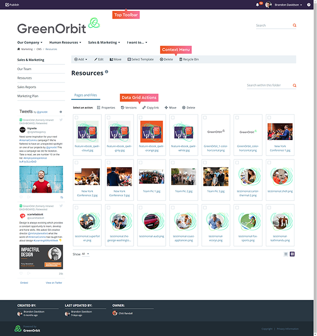
Multi-tiered action menus
A lot of work goes into the background development and market research of GreenOrbit’s intranet software. Here are some of the solutions we have implemented to ensure our software is dynamic, visually rich, and engaging:
GreenOrbit’s product design is different and unique for the following tangible reasons:
“Our relationship with our dealers is important. We are asking them to use the portal as the platform to communicate with us, so we have to ensure it is easy to use and offers a first rate experience…GreenOrbit delivered all the tools we needed to support our dealer communication, in a cost effective and easy to use package. We’re very happy with it, but more importantly, our dealers are happy.”
- Audi
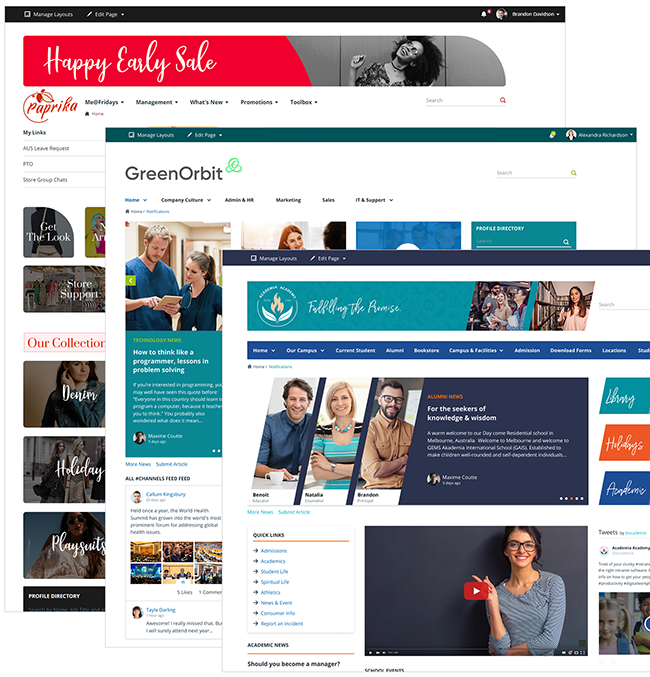
Visual examples of unique intranet designs built using GreenOrbit
Final SaaS Award winners will be announced on Tuesday 27 August 2019 and the program will return in Spring 2020. Over 400 organizations entered, with international entries coming from North America, Canada, Australia, UK, Europe, and the Middle East. View the full 2019 SaaS Awards shortlist.
There are a lot of great categories in the 2019 SaaS Awards and it wasn’t easy to become finalists. SaaS Awards and Cloud Awards organizer Larry Johnson said: “The standard of entries this year was incredibly high, with consistent attention to innovation and most importantly, customer success. The volume of entries warranting consideration of a place on the coveted shortlist was unprecedented.”
We are glad to be in great company with other companies and in the same category for UX/UI/Design such as:
Amongst others.
Best of luck to everyone!
Would you like to see how you can drive your business when implementing and enjoying the UX/UI/Design of GreenOrbit’s intranet software? Download our case studies here.
Do you have more questions around our intranet software? Request a demo.
