Back to Top

When designing themes and layouts for clients we ask them what the key design concepts of their intranet are. Quite often the answer is a combination of two contrasting themes e.g. “We would like our intranet to have a corporate look, but also feel fun and engaging”. What does this actually mean, and how do you achieve such a thing?
Designing “corporate but fun” intranets requires a clever balancing act. It’s very easy to go over the top one way or the other and ruin the design altogether. Below are some of the things we think about when we design for both:
Keeping the background neutral is important because it doesn’t allow the page background color to limit the use of imagery or color elsewhere.
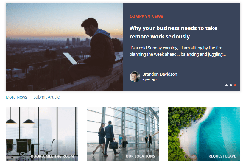
A 2 or 3 color palette is usually more than enough for an intranet. The more colors you use in your design the more confused the theme of your intranet will be. Intranet’s unlike websites contain multiple blocks of content using the same colors, therefore they require fewer colors. We quite often use background colors to distinguish between or highlight certain blocks of content.
Limit the amount of bold color blocks.
Too much bold color in a design usually indicates a less corporate theme. When used sparingly bold color blocks can be quite effective in highlighting important areas or functions.
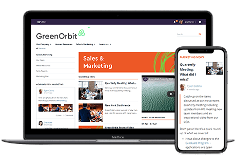
Imagery of people on an intranet gives the intranet a personal and approachable feel. People introduce warm colors to the design. If the client has imagery of their own staff we encourage using it in the design.

The fewer colors an image has, the less effective it is in presenting a warm friendly feel. Having said that, excessively colorful imagery can have the opposite effect. The best policy is to use imagery of real things (people, scenery) with more natural color palettes.
To sum it all up, it’s not easy to find the balancing act between “corporate” and “fun”, but by using a few simple tips it’s definitely achievable.